

I created this seamless pattern as part of my exploration into surface design, focusing on how composition, spacing, and flow can transform individual graphics into a cohesive repeating layout. While the crow and floral illustrations were sourced elements, the full pattern itself was designed by me. I built the repeat from scratch, arranging the artwork to create balance, rhythm, and visual interest across the tile. This involved adjusting scale, rotation, and placement to ensure the pattern loops cleanly without visible seams. The final design reflects my ability to take existing imagery and elevate it through thoughtful layout, color coordination, and pattern construction, turning separate graphics into a polished, production‑ready surface design.

I designed this seamless pattern combining my own illustrated book stacks with additional whimsical elements to create a magical, story‑themed pattern. The book stacks were hand‑drawn by me, each one colored and styled to represent different genres, giving the pattern a sense of personality and narrative. I then built the full seamless layout by arranging the books, mushrooms, and stars into a balanced composition that loops cleanly without visible edges. This process involved adjusting scale, spacing, and rotation to create rhythm and movement across the tile while keeping the dark background rich and atmospheric. The final design showcases my ability to blend illustration with pattern construction, turning individual drawings into a cohesive, production‑ready surface design that feels imaginative, playful, and visually engaging.

I created this seamless pattern for Scoop Shoppe as part of their brand expansion, using their existing ice cream icons to build a playful, high‑contrast repeat that matched the shop’s fun, modern personality. The icons were arranged into a balanced layout that loops cleanly, with careful attention to spacing, rhythm, and visual flow. I paired the pastel neon‑style graphics with a deep black background to make the colors pop and give the pattern a bold, energetic feel suitable for packaging, signage, or merchandise. This project showcases my ability to take client‑provided assets and transform them into a cohesive, production‑ready pattern that elevates their brand through thoughtful composition and strong visual impact.
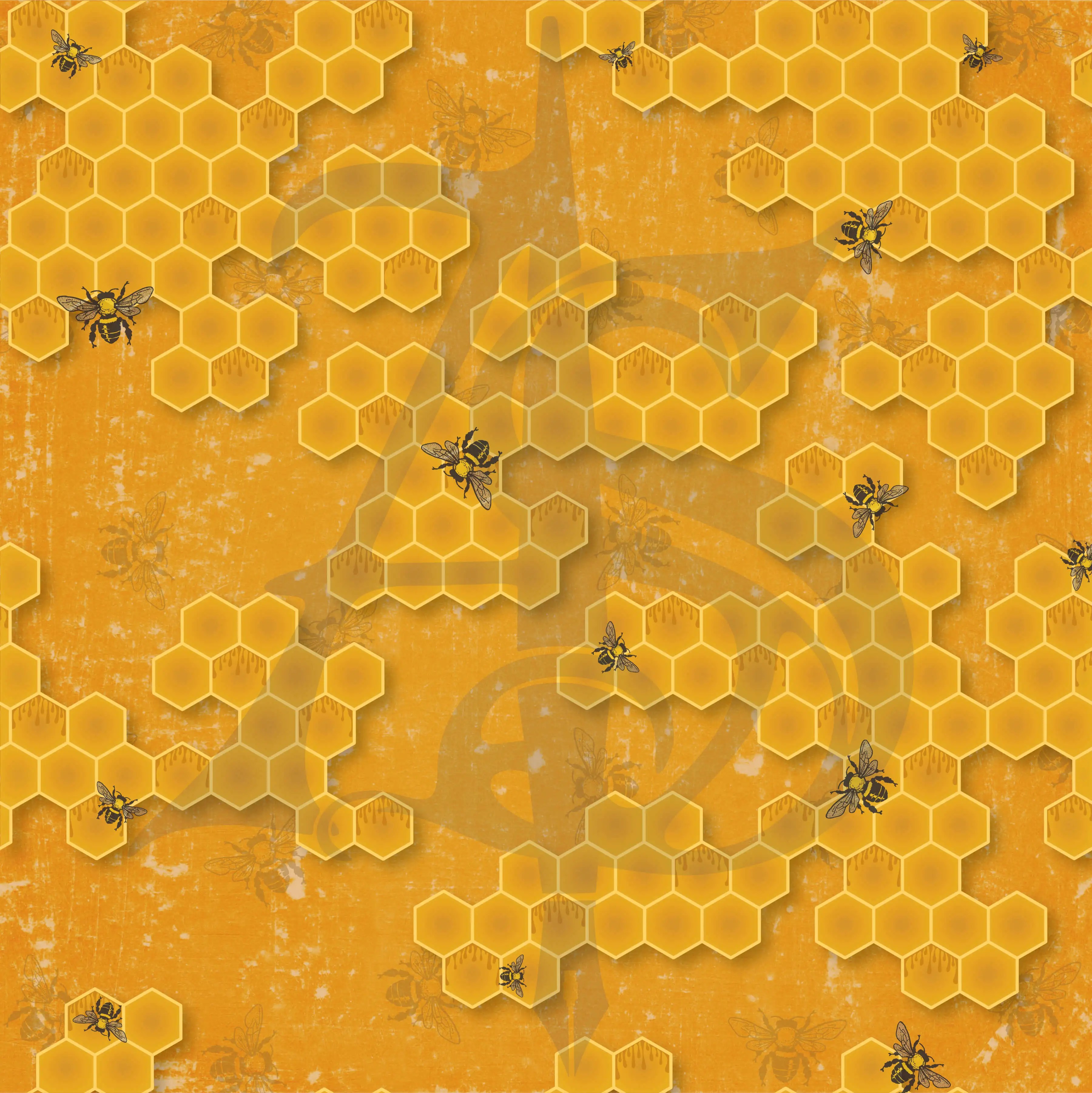
I created this honeycomb seamless pattern by building the entire layout, color palette, texture, and geometric structure myself while incorporating bee illustrations from sourced elements. The honeycomb clusters were designed to feel organic and slightly imperfect, giving the pattern a natural flow instead of a rigid grid. I layered subtle background textures and warm tones to add depth, then arranged the bees in a way that enhanced movement and visual rhythm across the repeat. The final tile loops cleanly, balancing structure with a rustic, nature‑inspired aesthetic. This piece showcases my ability to combine original pattern construction, thoughtful composition, and curated imagery into a polished, production‑ready design.